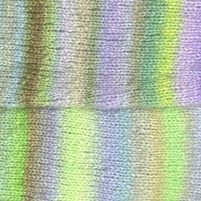
Unpacking Lang Cloud 14
Lang Cloud has a solid reputation in the knitting world—and it’s easy to see why. The yarn is soft, airy, and the colors are often striking in a way that’s hard to photograph. What makes it especially fun to work with is how unique each skein is. Even within the same dye lot, the shifts in color and sequence can vary, which makes the knitting experience feel a little bit more exciting and personal.
I’ve been working with Color 14 (Lavender Field) while making the Cloud Sweater by PetiteKnit. Since it’s a newer color, I wasn’t expecting a lot of project photos online—but the one swatch image that does exist doesn’t come close to showing what it really looks like.
It reads more like a soft pastel rainbow and doesn’t seem to have much purple at all—nothing like an actual lavender field. But I trusted the description (green, lilac, and blue), and since I’m always drawn to cool tones, I decided to go for it. And I’m really glad I did.
A Closer Look
In person, Color 14 has way more complexity than the swatch suggests. There’s a mix of vivid grass green, sky blue, dusty lilac, soft periwinkle, chartreuse, muted olive, and bits of earthy brown that show up throughout. Some of the purples lean cooler, while others edge into pinkish or smoky tones. The overall effect brings understanding to its name, Lavender Field.
How the colors show up depends a lot on where you are in the sweater. Some areas stripe more tightly, while others shift more gradually. On the sleeves, for example, the transitions feel broader and more blended. On the body, they stack a little closer together. That variation keeps things interesting and gives the final fabric a kind of natural, painterly rhythm.
The Vibe
The more I knit with it, the more it reminded me of impressionist paintings—especially Monet’s garden scenes. There’s something about the way the colors layer and interact that feels like a landscape, not just yarn. The dense striping and atmospheric shifts bring to mind the soft brushstrokes and blurred edges you get in pieces like Water Lillies or Wisteria.
To give you a better idea of the feel I’m talking about, here are a few paintings that capture the same sort of mood and palette:
 |
| The Artist’s Garden at Giverny by Claude Monet |
 |
| Lavender Fields in Old Provence by Timothy Easton |
 |
| Water Lily Pond by Claude Monet |
 |
| Flowers in the Window by Mary Cassatt |
If you’ve been eyeing Color 14 and haven’t been able to decide if it’s the color for you, hopefully this gives you a better sense of what’s actually in the skein. It’s more vivid, more layered, and more dynamic than the swatch lets on. If you’re drawn to cool tones and that impressionist, slightly wild and earthy look, I think you’ll really like it. That being said, I’m not sure you can go wrong with any of the Lang Cloud colors—I’m already looking forward to trying more.


Comments
Post a Comment